It was hard to decide what to include in this post! Looking through Katie's portfolio was such a joy, like turning over the pages of a beautiful book just to be greeted with beautiful colour combinations and layers of pattern with every turn. Harmonious analogous colour schemes accented with a complementary colour for impact and for added fun, beautiful Chinoiserie patterns combined with bold geometrics and the use of beautiful wallcoverings and fabrics characterize the interiors of New York based
Katie Ridder. She often included in the list of top designers in publications like House Beautiful and Elle Decor.
 |
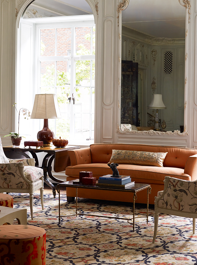
I love this beautiful triadic colour scheme where the chartreuse green and turquoise are paired with a deep burgundy for accents, and the whole room is grounded and framed by earthy warm grays and browns.
Image: Katie Ridder www.katieridder.com |
 |
The primary colours red, yellow and blue create a lot of excitement in this design and the shades of blue paired with green tones it down enough to make it gorgeous!
Image: Katie Ridder www.katieridder.com
|
 |
The primary colours red, yellow and blue create a lot of excitement in this design and the shades of blue paired with green tones it down enough to make it gorgeous!
Image: Katie Ridder www.katieridder.com |
 |
| A beautiful example of an analogous colour scheme, the blues and greens creating a harmonious look which is accented with white. Image: Katie Ridder www.katieridder.com |
 |
I love the warm colour scheme of this room and how the abstract painting stays in the focal point.
Image: Katie Ridder www.katieridder.com |
 |
The red and blue paired create a vibrant and playful room!
Image: Katie Ridder www.katieridder.com |
 |
| This room is so calm and serene. The analogous coral, pink and yellow are accented with greens. Image: Katie Ridder www.katieridder.com |
 |
| Another example of beautiful coral tones paired with green and turquoise creating a fresh split complementary colour scheme. Image: Katie Ridder www.katieridder.com |
 |
| Another example of beautiful coral tones paired with green and turquoise creating a fresh split complementary colour scheme. Image: Katie Ridder www.katieridder.com |
 |
| I love the mood of this blue room. It's bright and calming at the same time. Image: Katie Ridder www.katieridder.com |
 |
| Lavender walls create such a calm room, even with the excitement of the zebra pattern rug! Image: Katie Ridder www.katieridder.com |
 |
| Wallpapered powder rooms always make a statement! I love how the colour of the fern matches the birds in the wallpaper design. Image: Katie Ridder www.katieridder.com |
 |
| A beautiful bohemian decor. Image: Katie Ridder www.katieridder.com |
 |
The painting and the orange seating create such a cohesive room!
Image: Katie Ridder www.katieridder.com |
 |
| Sophisticated and warm at the same time! Image: Katie Ridder www.katieridder.com |
 |
| This lively colour scheme creates such a cozy little nook. I always love pink and green together, because the colour combination reminds me of spring! Image: Katie Ridder www.katieridder.com |
 |
| If the previous image was spring, then this one must be summer! Image: Katie Ridder www.katieridder.com |
 |
| I love Eastern influences in decor and I'm a huge sucker for cranes! Image: Katie Ridder www.katieridder.com |
xo, Judit


Comments